Native lazy loading is landed in Chrome
Lazy loading resources is one of the important parts of web performance tuning, simply because offscreen resources can add a lot of weight to your page if loaded eagerly.
Intro
I’ve gone through many tips and tricks in my image optimisation article which is one of the series I’ve done on web performance. However, when it comes to lazy loading, I mentioned that you have two options:
- Use
data-srcattribute on<img>tag and hook into either ofscroll,resize, ororientationChangeto figure out when to replace thedata-srcwithsrcto make the call. - Use
IntersectionObserverAPI to asynchronously observe the changes and make the call when the item in is the viewport.
The good news is, from Chrome 76, you can use the loading attribute of an image tag to tell the browser how to load the image.
In fact it’s so simple that you won’t believe it 🤯:
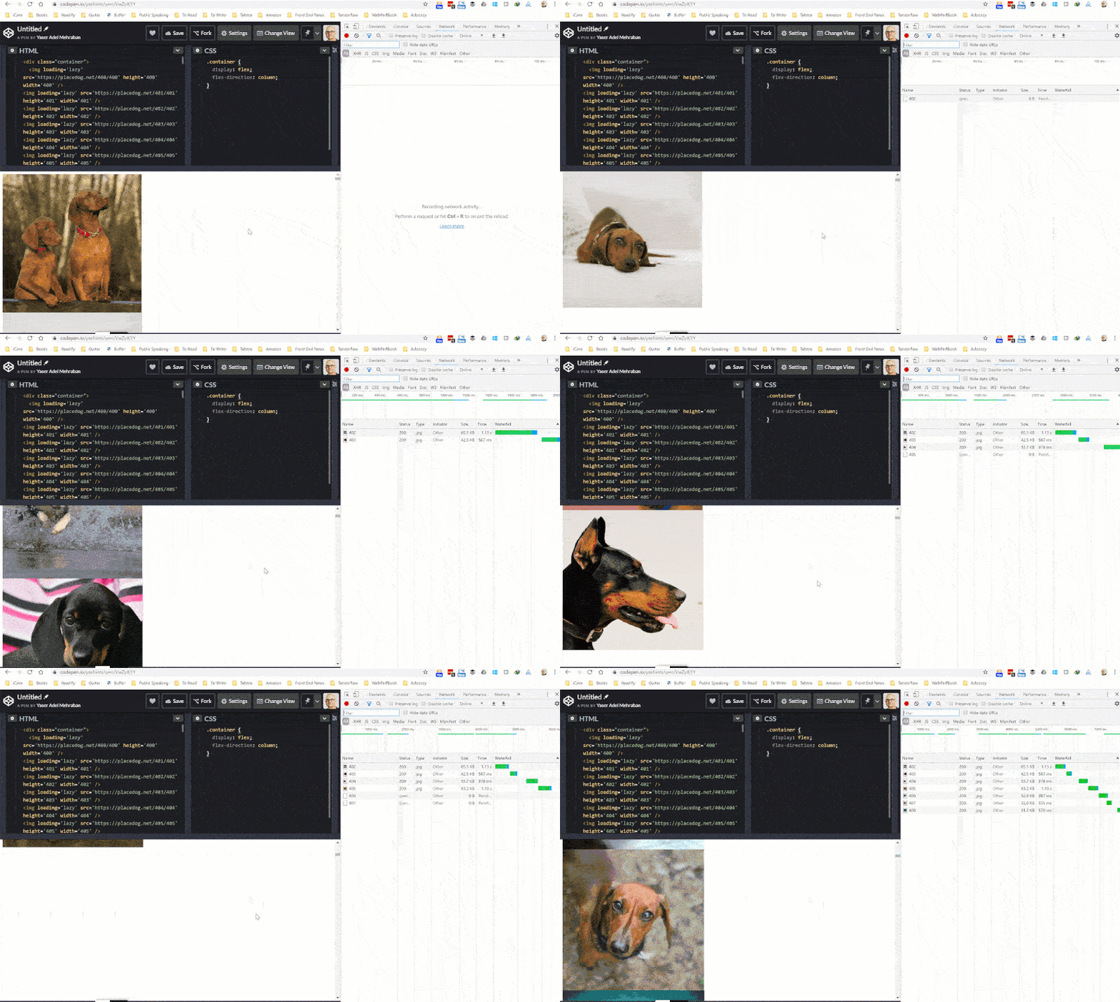
<img src="../path/to/image.jpg" loading="lazy">I’ve created a demo to show you how it works, look closely on the network tab.

Here is a CodePen which contains the code.
I’ve just used below bash script to hack together the HTML 🤷🏽♂️.
for i in {400..499};
> do echo "<img loading='lazy'
src='https://placedog.net/${i}/${i}' height='${i}' width='${i}' />";
> done
About the attribute
Currently the images are fetched with different priority in Chrome, the ones which are not in the viewport have less priority. But they’re fetched as soon as possible regardless.
With this new loading attribute, you can completely defer the loading of offscreen images (and iframes) to when they’re reached by scrolling:
<img src="../path/to/image.jpg" loading="lazy">
<iframe src="https://placedog.net" loading="lazy"></iframe>
You can use three values with this attribute:
auto: Default behaviour of the browser, equal to not including the attribute.lazy: Defer loading of resources until it reaches a calculated distance from viewport.eager: Load the resource immediately
My Chrome version is 76.0.3809.100 as of writing this post, but if you have any of the previous version below 76, you can activate this using flags:
- For images 👉🏽
chrome://flags/#enable-lazy-image-loading - For iframes 👉🏽
chrome://flags/#enable-lazy-frame-loading
Feature detection
If you want to use this attribute today, you can use below code to feature detect it and have a polyfill in place such as loading-attribute-polyfill.
if ('loading' in HTMLImageElement.prototype === true) {
  // use the attribute
} else {
  // use polyfill
}
Prevent content reflow
Since the images are lazy loaded, if you haven’t set width and height for your image, the content might reflow when the image is loaded and fill its place. To prevent that to happen, simply set the required values on the image tag by either style or directly using width and height attributes:
<img src="../path/to/image.jpg"
loading="lazy" width="200" height="200">

<img src="../path/to/image.jpg"
loading="lazy" style="height:200px; width:200px;">
iframe loading
The same behaviour is applied to iframe when it’s used with loading attribute. However, there are times when an iframe is hidden for analytics purposes. Examples are they are very small (less than 4px in width and height), or they have display:none or visibility: hidden applied to them, or simply is offscreen using negative margin.
In these cases it won’t get lazy loaded even if you have used the attribute.
What’s the catch
There are few points you have to consider when using lazy loading in general. Plus there are a few things you can’t do with the loading attribute as of now.
Can’t do
- You can’t change the threshold to load the resource for now since it’s been hard coded in the source.
- This can’t be used with CSS’ background image for now
Catches
- This might affect the third party ads since they will be lazy loaded too
- There will be side effect when printing 😉, as in the lazy loaded resources won’t be printed. However, there is an open issue you can follow.
What about other browsers?
For now, Chrome is the only browser supporting this feature. Although there is an open bug for Firefox and nothing for Edge and IE.
Happy lazy loading everybody and make sure not to miss the catches 👋🏽.
